It is your handshake or the reception hall where you make clients wait before, say, a meeting or a negotiation. Your handshake must be warm and firm. Your waiting hall should have comfortable good-looking chairs, and an attentive receptionist. In the same way, you should pay attention to your landing page web design.
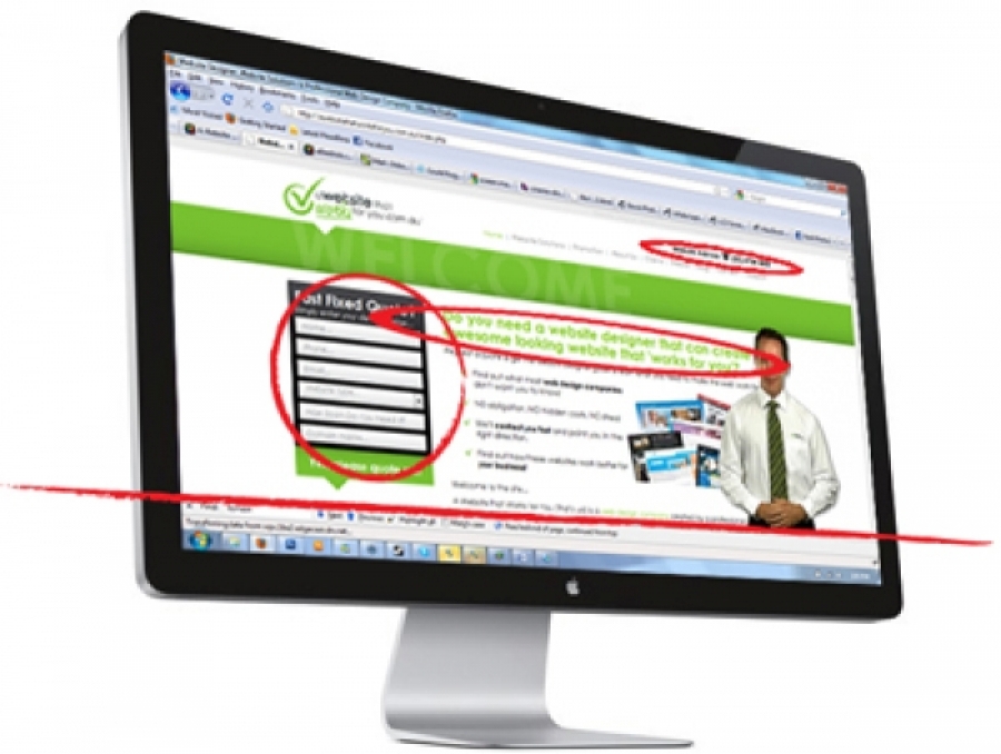
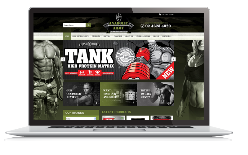
Your landing page design is the receptionist that greets your prospective online clients. Thus, it is important to make a good first impression. Your landing page should engage your audience enough so they stay longer. It should encourage them to navigate further, check out your other pages, and perhaps click on your “Buy” button.
To get this done, your website should be defined by three things: relevant original content, ease of navigation, and transparency and trustworthiness. Here are some tips to help you:
1. Include only content that counts on your landing pages. This means you should have enough helpful information that is relevant to your website and what you're trying to sell. With all this talk about keyword density and the ideal number of words per website page, some people become desperate and pad their page with nonsense. Not only will this turn off your online audience, you might get penalized too for spamming your page.
2. Your landing page should be keyword optimised. This means using targeted meta text, as well as content that makes use of your keywords. It also means not over-stuffing your content with keywords. Write your keywords into your content naturally. Think about your readers, not the search engine spiders only.
3. If your landing page is trying to sell your product or service, it's a good idea to highlight its best features. This helps sell; plus, it saves your audience a lot of time. When they land on your page interested in your product or service, they will still want more information. Convince them right off the bat. Give them a short outline of why to buy from you.
4. Make it easy for people to navigate around your website. People normally don't always enquire or buy right away. They may want more information, or perhaps a way to contact you about purchasing details. Don't give them a hard time. Include an easy-to-understand menu, with logically organised links.
5. Include a Buy link or button that's easy to spot on your landing page.
6. Stay away from intrusive popups. These keep your audience from focusing on your website and your message. Plus, it might just annoy them.
7. Label advertisement. Your audience should be able to differentiate this easily from your content.
8. Make contact easy. This means having a contact form with a relevant call to action, and including your location and business phone number. A trustworthy landing page shouldn't seem like it's hiding something from people
9. Include an About Us page that talks about your company, history and goals.
Remember: your landing page design is crucial to your online marketing efforts. It directly affects how you are able to convert online visitors into buyers. Invest in your landing page web design. This is the starting point of online marketing that works!


